💻 3D Laptop CSS Quiz
Test our understanding of the CSS behind the laptop.
🎉 Quiz Complete!


Test our understanding of the CSS behind the laptop.
The CSS property transform-origin defines the point around which a transformation is applied to an element. It is the point or origin of the transform property which can change the point of transformations like rotation, scaling, skewing, etc. By default, the transform-origin of an element is relative to the center of an element.

Video Tutoral at https://youtu.be/-MZvSn6pOyg
The transform-origin property is used along with the transform property. For example, if we use, transform: rotateZ(30deg); and transform-origin: top;, the point of transformation or rotation starts from the top center.
If you want to keep the transform-origin at the center, then there is no need to use the transform-origin property. This is because the transform-origin is at the center by default. However, if you want to shift your transform-origin, then you have to use it.
If we set here the transform-origin: bottom;, then the transform-origin is at the bottom center. Similarly, you can set transform-origin: left;, transform-origin: right;, transform-origin: top;, transform-origin: top right;, transform-origin: bottom left;, etc.
transform-origin: top right; Here the transform-origin has shifted to the top right corner.
Instead of using transform-origin: right bottom;, we can use transform-origin: 100% 100%;. Here, the first value is x, and the second value is y. Both x and y move 100% away from 0, intersecting at the right bottom corner. So, transform-origin: 100% 100%; is the same as transform-origin: right bottom;.
transform-origin: 50%; : Here, 50% represents the X value. Even though nothing is mentioned for Y, it still means that the Y value is 50% by default.
transform-origin: 50% 50%; : In this case, we find that both the x and y values are each specified as 50%.
transform-origin: 50% 0; : Here, the x value is 50% and the y value is 0, which sets the transform-origin to the top center.
Here are some examples of transform-origin values that give the same effects. Please go through all of these:
/* Left transform-origin */
transform-origin: 0;
transform-origin: left;
transform-origin: center left;
transform-origin: left center;
transform-origin: 0 50%;

/* Top left transform-origin */
transform-origin: top left;
transform-origin: left top
transform-origin: 0 0;

/* Top transform-origin */
transform-origin: top;
transform-origin: top center;
transform-origin: center top;
transform-origin: 50% 0;

/* Top right transform-origin */
transform-origin: top right;
transform-origin: right top;
transform-origin: 100% 0;

/* Right transform-origin */
transform-origin: right;
transform-origin: 100%;
transform-origin: center right;
transform-origin: right center;
ransform-origin: 100% 50%;

/* Bottom right transform-origin */
transform-origin: bottom right;
transform-origin: right bottom;
transform-origin: 100% 100%;

/* Bottom transform-origin */
transform-origin: bottom;
transform-origin: bottom center;
transform-origin: center bottom;
transform-origin: 50% 100%;

/* Bottom left transform-origin */
transform-origin: bottom left;
transform-origin: left bottom;
transform-origin: 0 100%;
Index
Hover your mouse on the above square.
Transform-origin: x-offset value, y-offset value, z-offset value; This is the main syntax for transform-origin values. We have x-offset value which defines the horizontal position of the origin. The second one is y-offset value which defines the vertical position of the origin and the third is z-offset value which defines the position along the z-axis (depth) when using 3D transformations.
Transform-origin value can be one-value syntax, two-value syntax and three-value syntax. The three-value syntax can be used specially in a 3D element. Here are examples of one-value syntax, two-value syntax, and three-value syntax. Please go through all of these. Please note that z-offset cannot be used in percentage because there is no measurable or clear size on the z-axis.
Examples:
/* 1. One-value syntax */
transform-origin: 3px;
transform-origin: top;

/* 2. Two-value syntax */
transform-origin: 5cm 3px;
transform-origin: 80% 30%;
transform-origin: left 2px;
transform-origin: right top;
transform-origin: top right;

/* 3. Three-value syntax */
transform-origin: 2px 30% 10px;
transform-origin: left 5px -4px;
transform-origin: right bottom 5cm;
transform-origin: bottom right 9cm;
We can also use Global Values in transform-origin. Here, we have:
/* Global values: */
transform-origin: inherit;
transform-origin: initial;
transform-origin: revert;
transform-origin: revert-layer;
transform-origin: unset;
In CSS, global values control how properties are applied or reset by inheriting values, using default settings, or reverting to previous or default states.
So in conclusion, the transform origin is very useful when we animate or style our transformations. By changing the transform origin, we can make the visual effect of an element look much better.
.If you look at every website, you will find the vertical scrollbar on the right side of the webpage. The vertical scrollbar is showing by default yet we can design it into a better scrollbar on our website.

Video Tutoral at https://youtu.be/jB20Qhzt3dU

Video Tutoral at https://youtu.be/bo4HN8R_lPY
1. Code Before Using rowspan & colspan: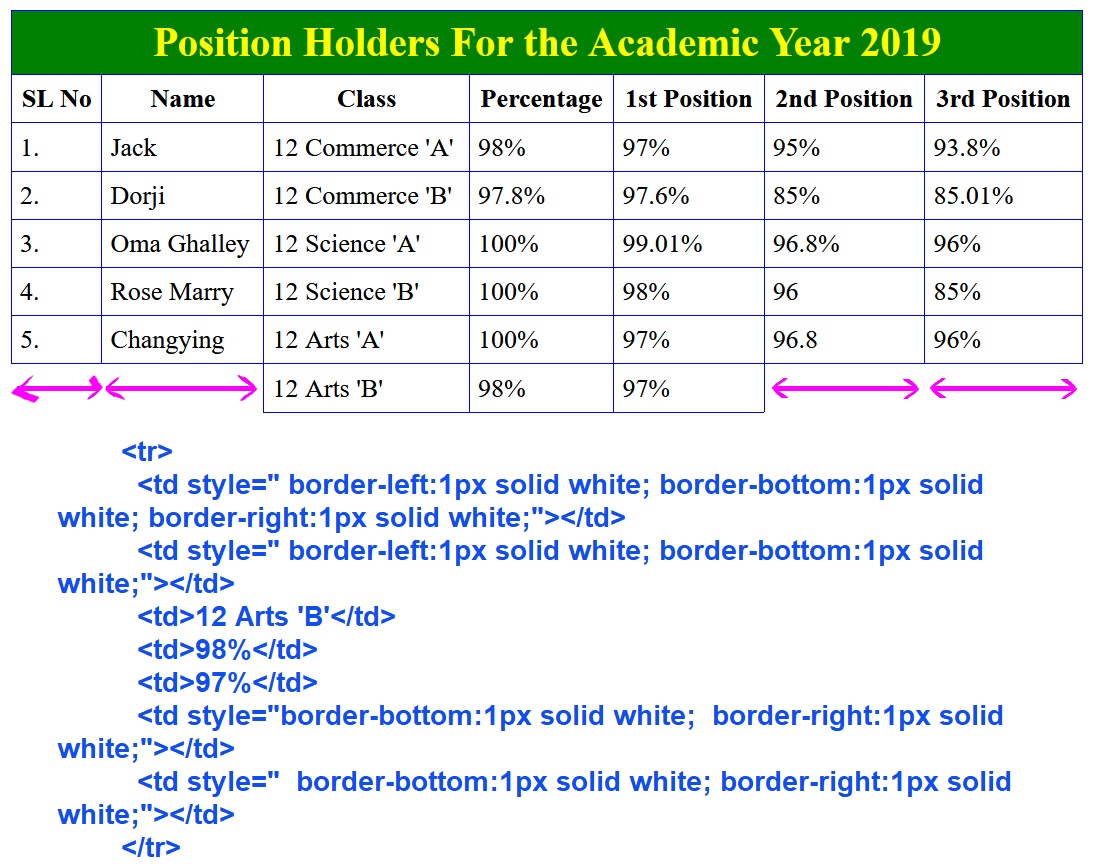 Full code:↓
Tables are crucial elements of any website as they are used to present and organize data in a structured manner. However, large tables with numerous rows and columns can often cause the web page to exceed its intended size and make it difficult for users to view the data. This is where a scrollbar becomes indispensable, enabling users to navigate through the table with ease and without having to resize their browser window.

Try it at https://codepen.io/sirchogyal/pen/QWZaKpY
The first step in creating a table with a scrollbar is to create an HTML table. For our example, we will be using a table with five columns and five rows. Below is the HTML code for the table with a horizontal scrollbar using HTML and CSS and if you reduce the height, the vertical scrollbar from the right side will also appear. The table contains five columns: "SL No", "Particulars", "Quantity", "Unit Price", and "Total Amount (USD)". Each row of the table displays data related to an office furniture item, including the item number, description, quantity, unit price, and total amount in US dollars.
HTML CodeAfter creating the HTML table, we need to apply some CSS styles to add a scrollbar. The following is the CSS code for the scroll-bar class:
StylesheetThe scroll-bar class contains CSS styles for the scrollbar. The height and width properties define the dimensions of the scrollbar container. The border property sets the border of the scrollbar container, while the font-family property sets the font family of the text inside the scrollbar container. The overflow property determines whether to clip the content or to add a scrollbar.
To add a horizontal scrollbar to the table, we can use the white-space property to prevent the text from wrapping and overflow-x property to add a horizontal scrollbar.
To add a vertical scrollbar, we can use the overflow-y property to add a vertical scrollbar to the scrollbar container. It's essential to set a height for the scrollbar container to ensure that the scrollbar appears.
With these simple steps, you can now create a table with a scrollbar using HTML and CSS. Experiment with different properties and styles to customize the scrollbar and the table to suit your requirements.
Adding a scrollbar to a table using HTML and CSS is an excellent way to present data in an organized and user-friendly way. With the code snippet provided in this blog post, you can easily create a table with a scrollbar and customize it to fit your specific needs. A scrollbar makes it easy for users to navigate through large tables, ensuring that your website remains easy to use and visually appealing.

Video Tutoral at https://youtu.be/mG0bV78HtvY
As a website owner, you might not want to reveal the image URL of your website for various reasons. Maybe you don't want other websites to hotlink your images or want to protect your images from being downloaded by others. Whatever your reason, hiding the image URL can be a useful technique. Use the necessary code below to hide an image URL from your website.
HTML
Video Tutoral at https://youtu.be/_7tYMHiV_WY
The matrix() function in CSS defines a homogeneous 2D transformation matrix where it consists of 6 parameters like scale()X, skew()Y, skewX(), scaleY(), translateX(), and translateY().
The syntax for the matrix() function is: matrix(a, b, c, d, tx, ty); where, a represents scaleX(), b represents skewY(), c represents skewX(), d represents scaleY(), tx represents translateX(), and ty represents translateY().
The first four values describe the linear transformation, while the last two values describe the translation to apply.
The scale values control the size of the element, while the skew values control the angle at which the element is skewed. The translate values move the element along the X and Y axis.
Here you can see how the matrix() function can also be the shorthand for the matrix3d() function but only when some of the values are 0 in the matrix3d() function as shown below.
Matrix(a, b, c, d, tx, ty) = matrix3d(a, b, 0, 0, c, d, 0, 0, 0, 0, 1, 0, tx, ty, 0, 1)
HTML
Here, we have font-weight: normal;. This declaration provides the text with just the regular thickness of the font. If we don't specify any font-weight, the browser will use the normal weight by default.
The following are the font-weight values used in CSS:
font-weight: normal;
font-weight: bold;
font-weight: lighter;
font-weight: bolder;
font-weight: 100;
font-weight: 900;
You can also express the font-weight values in digits:
100 (Thin)
200 (Extra Light)
300 (Light)
400 (Normal)
500 (Medium)
600 (Semi Bold)
700 (Bold)
800 (Extra Bold)
900 (Black/Boldest)
If I use font-weight: 200, it means "extra light", okay and font-weight: 800 is "extra bold".

Video Tutoral at https://youtu.be/QLY1boMytyA
Despite, we rotate the element using the rotateX(), rotateY(), and rotateZ() functions, the same effect can be achieved using the matrix() and matrix3d() functions. All we have to do is apply some formulas.
We can calculate rotate() or rotateZ() of a 2D element by using the matrix() function with the formula stated here: transform: matrix(cosθ, sinθ, -sinθ, cosθ, 0, 0); I have kept 0 for both the translateX() and translateY() parameters so that we can see the rotations very clearly.
%20rotations.jpg)
Video Tutoral at https://youtu.be/Qoz0K5k7lHo

Video Tutorial at: https://youtu.be/tUzscpat6Hw
In this post, you will learn how to use a half of <br> tag or reduce the height of a <br> tag, or adjust the height of a line break in HTML. It's so easy and straightforward.
The following code demonstrates how the line-break or <br> tag's height can be adjusted.
You can also use line-height property to adjust the line break's height. But the code above uses margin-bottom property to adjust the height of a line break.
To create line breaks, we have to use <br> tags. I can add <br> tags to create more line breaks but if I wanted to reduce the height of the gap created below a text line, it is a way bigger problem for us. So here in this post, I disclose my little tips and tricks to reduce the height of a line break in HTML.
You can remove <br> tags. Give an id name to an element and start styling it. You can use something like margin-bottom property to adjust the space below a text line. Use margin-top property if you are adjusting the space above a text line. Also make sure to use display: block; When we use display: block;, it automatically creates a line break equivalent to one <br> tag for each text line.
This is how you can adjust the height of a line break in html.


